UI & configuration
Change one aspect of the interface and compare the result. These are independent native Zensical builds, all using the same field-guide content. Page-level options are demonstrated separately.
Branding · Footer · Customization · Build behavior
Page-level layout · Site behavior · External services
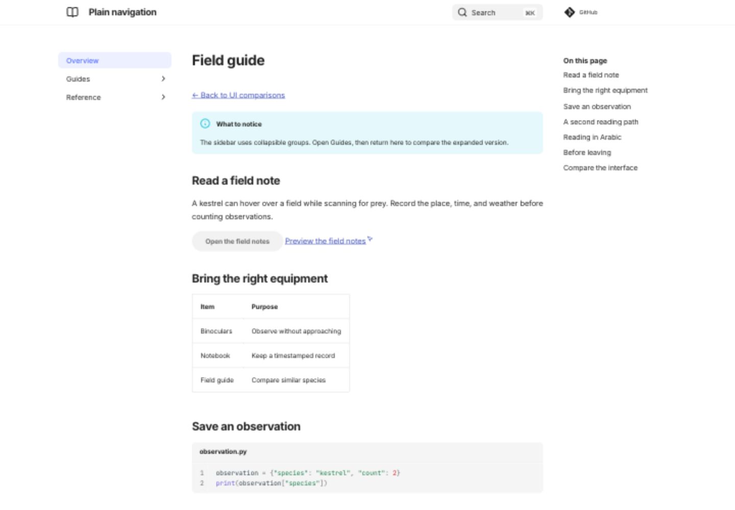
Plain navigation
The sidebar uses collapsible groups. Open Guides, then return here to compare the expanded version.
Open live plain navigation demo
Screenshot: Plain navigation
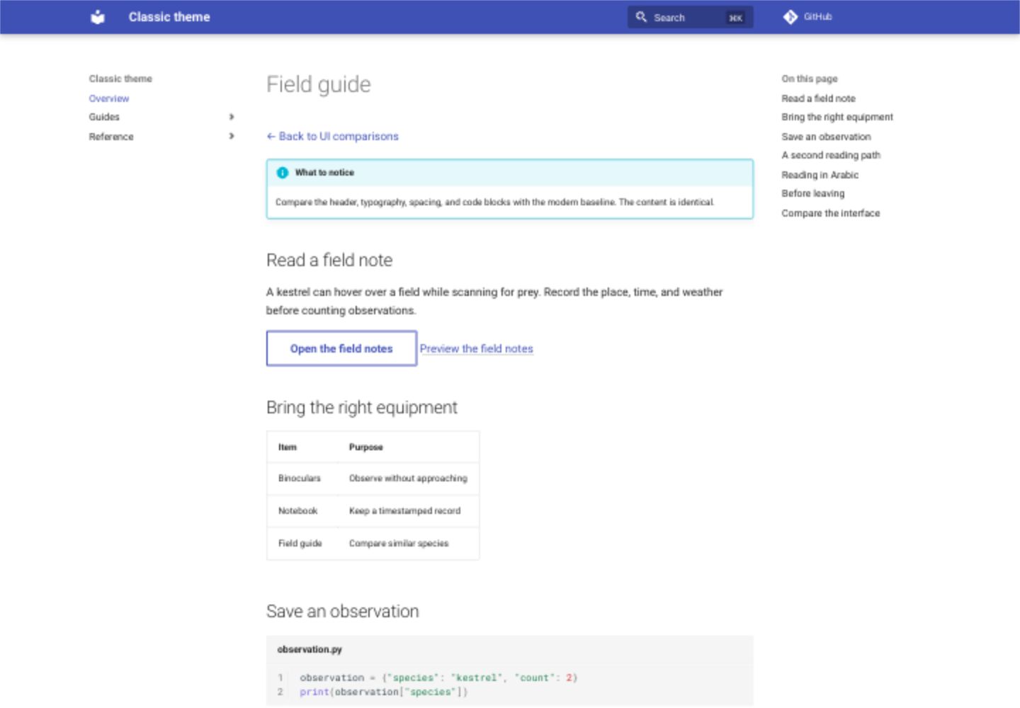
Classic theme
Compare the header, typography, spacing, and code blocks with the modern baseline. The content is identical.
Screenshot: Classic theme
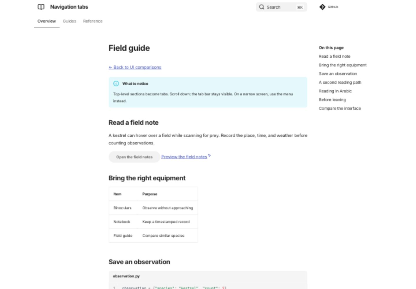
Navigation tabs
Top-level sections become tabs. Scroll down: the tab bar stays visible. On a narrow screen, use the menu instead.
Open live navigation tabs demo
Screenshot: Navigation tabs
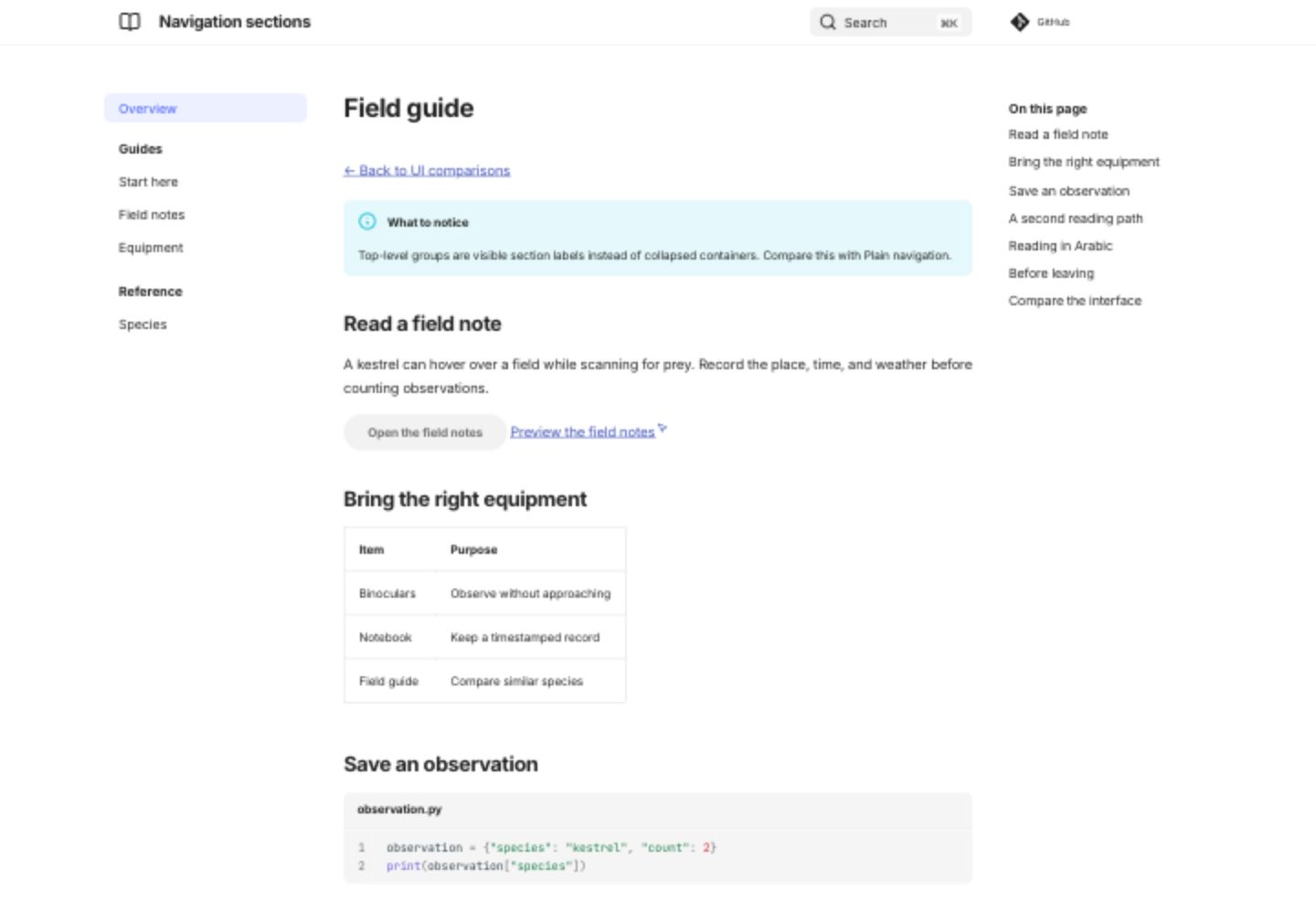
Navigation sections
Top-level groups are visible section labels instead of collapsed containers. Compare this with Plain navigation.
Open live navigation sections demo
Screenshot: Navigation sections
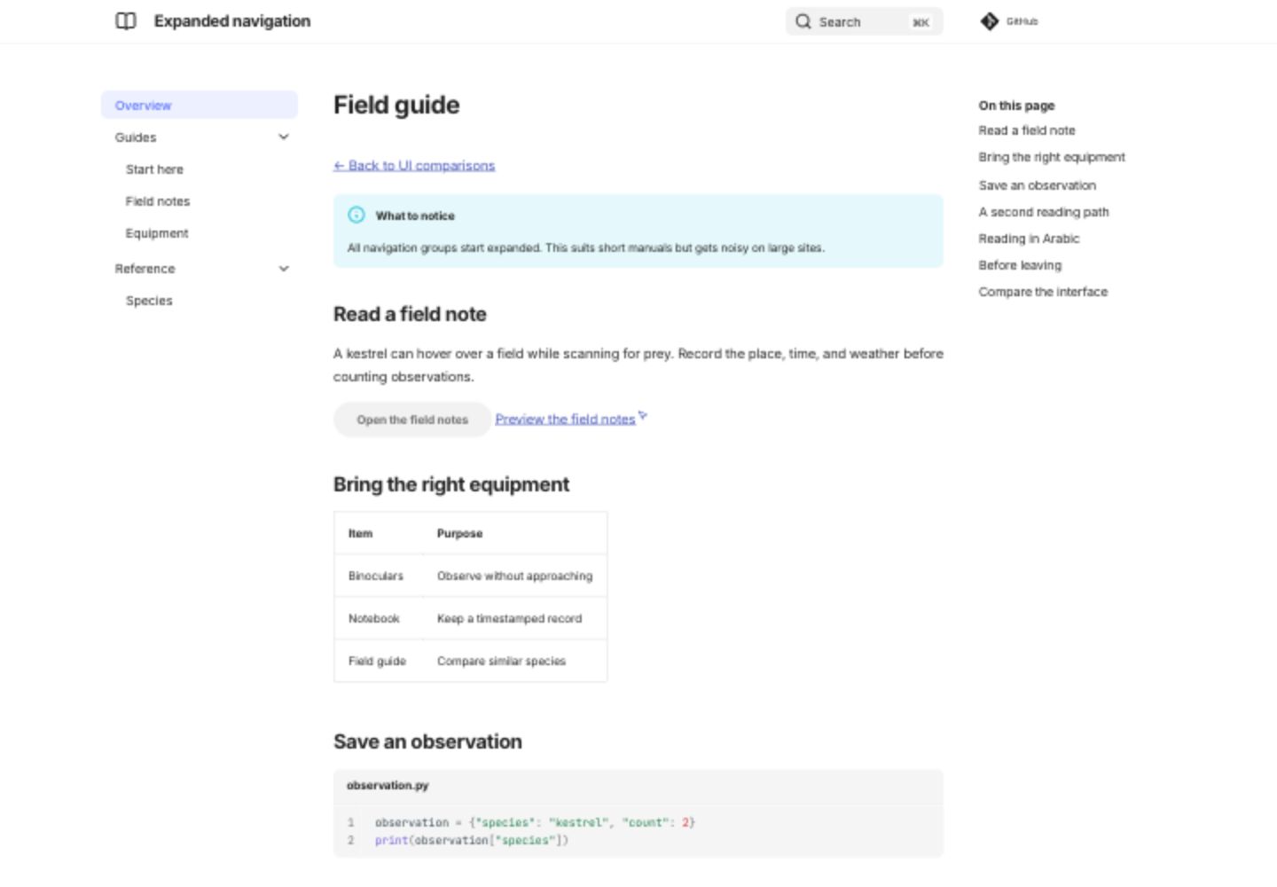
Expanded navigation
All navigation groups start expanded. This suits short manuals but gets noisy on large sites.
Open live expanded navigation demo
Screenshot: Expanded navigation
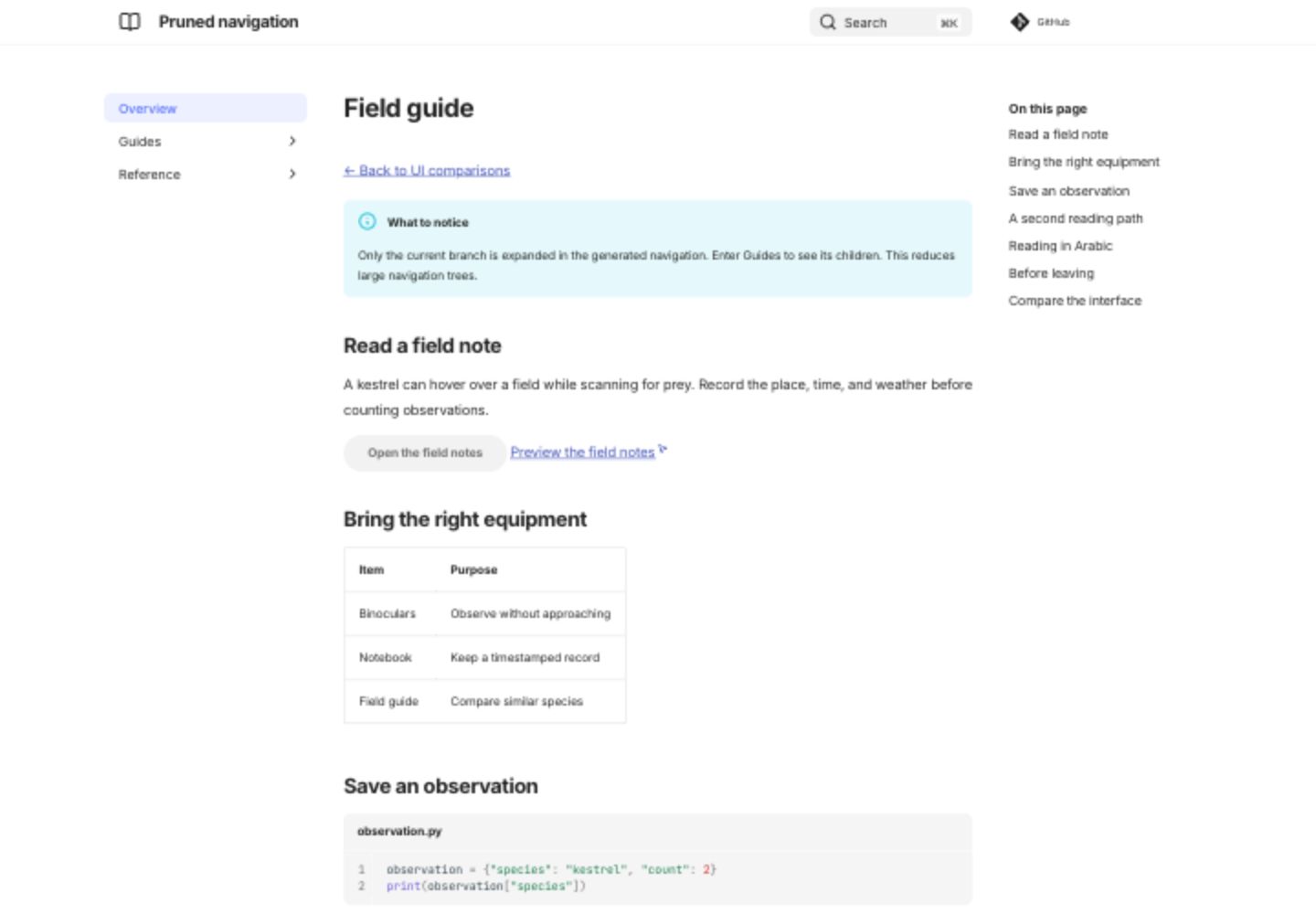
Pruned navigation
Only the current branch is expanded in the generated navigation. Enter Guides to see its children. This reduces large navigation trees.
Open live pruned navigation demo
Screenshot: Pruned navigation
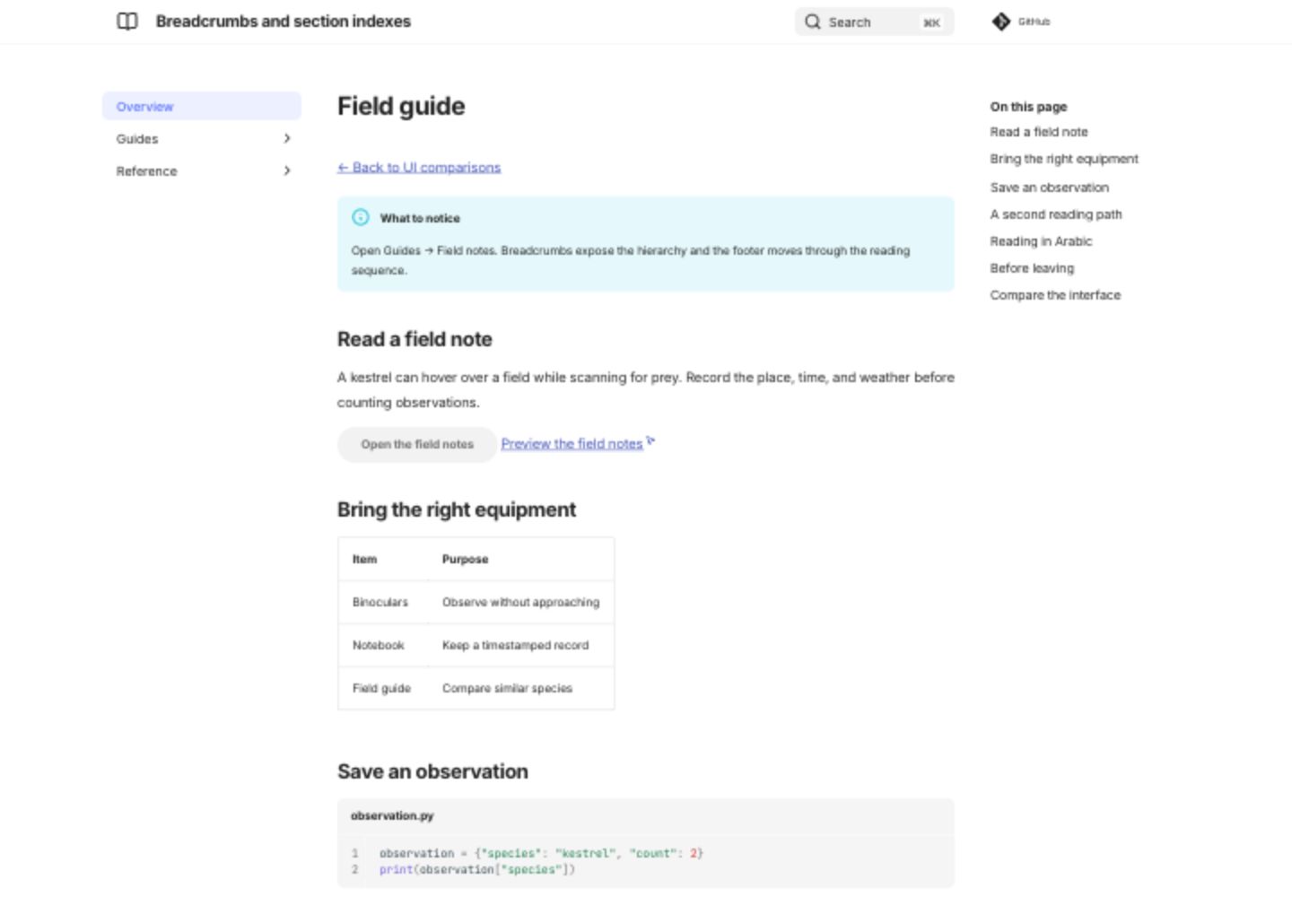
Breadcrumbs and section indexes
Open Guides → Field notes. Breadcrumbs expose the hierarchy and the footer moves through the reading sequence.
Open live breadcrumbs and section indexes demo
Screenshot: Breadcrumbs and section indexes
Settings used in this comparison
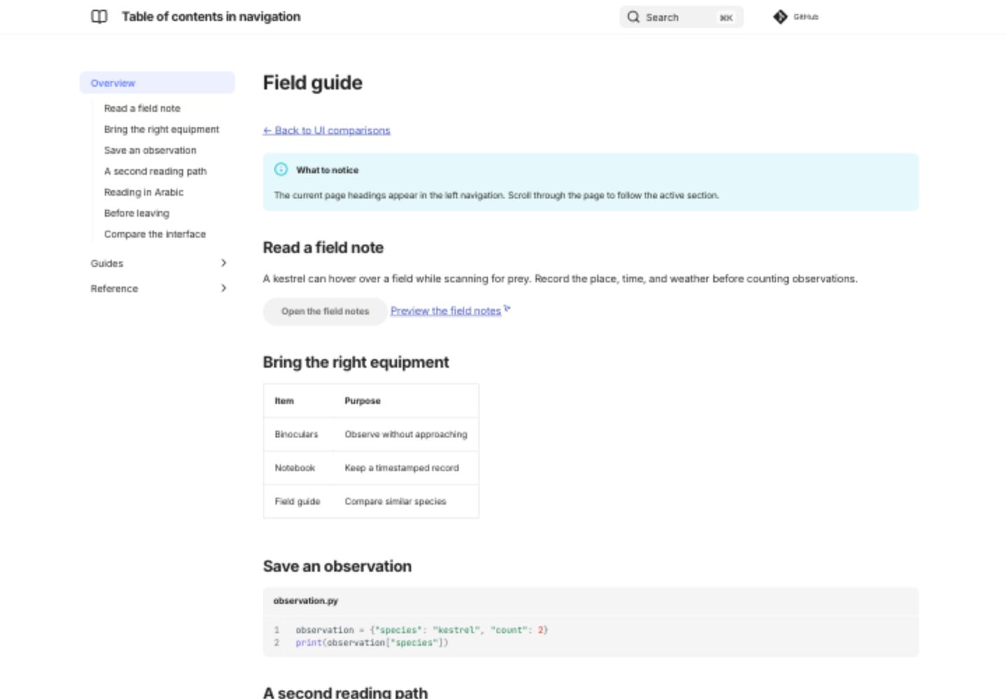
Table of contents in navigation
The current page headings appear in the left navigation. Scroll through the page to follow the active section.
Open live table of contents in navigation demo
Screenshot: Table of contents in navigation
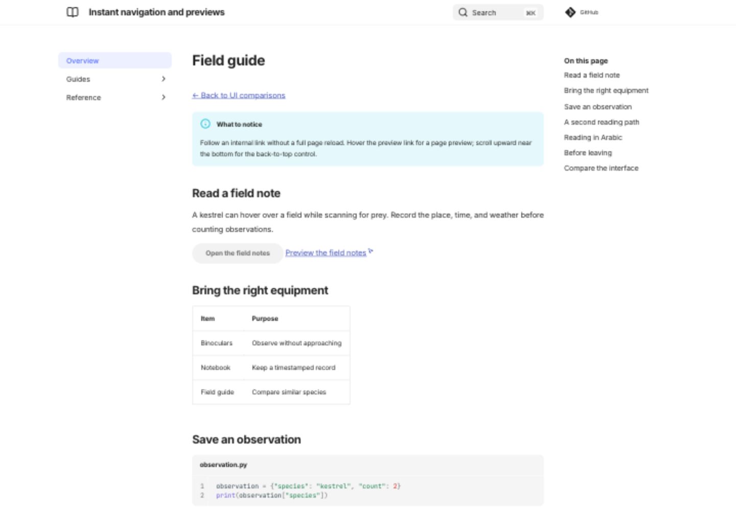
Instant navigation and previews
Follow an internal link without a full page reload. Hover the preview link for a page preview; scroll upward near the bottom for the back-to-top control.
Open live instant navigation and previews demo
Screenshot: Instant navigation and previews
Settings used in this comparison
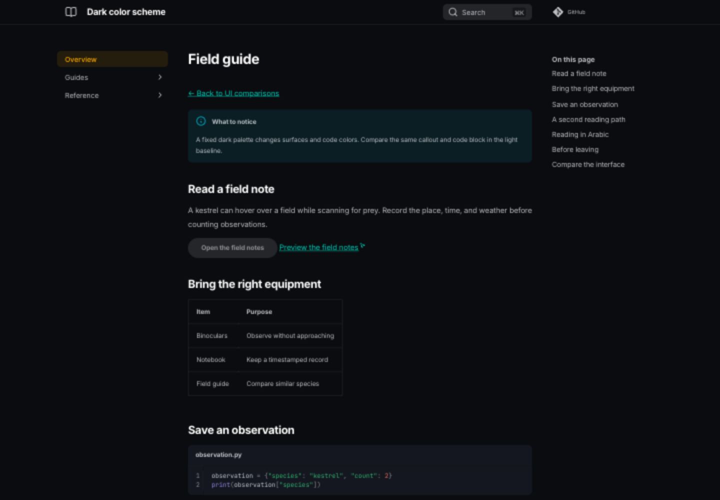
Dark color scheme
A fixed dark palette changes surfaces and code colors. Compare the same callout and code block in the light baseline.
Open live dark color scheme demo
Screenshot: Dark color scheme
Settings used in this comparison
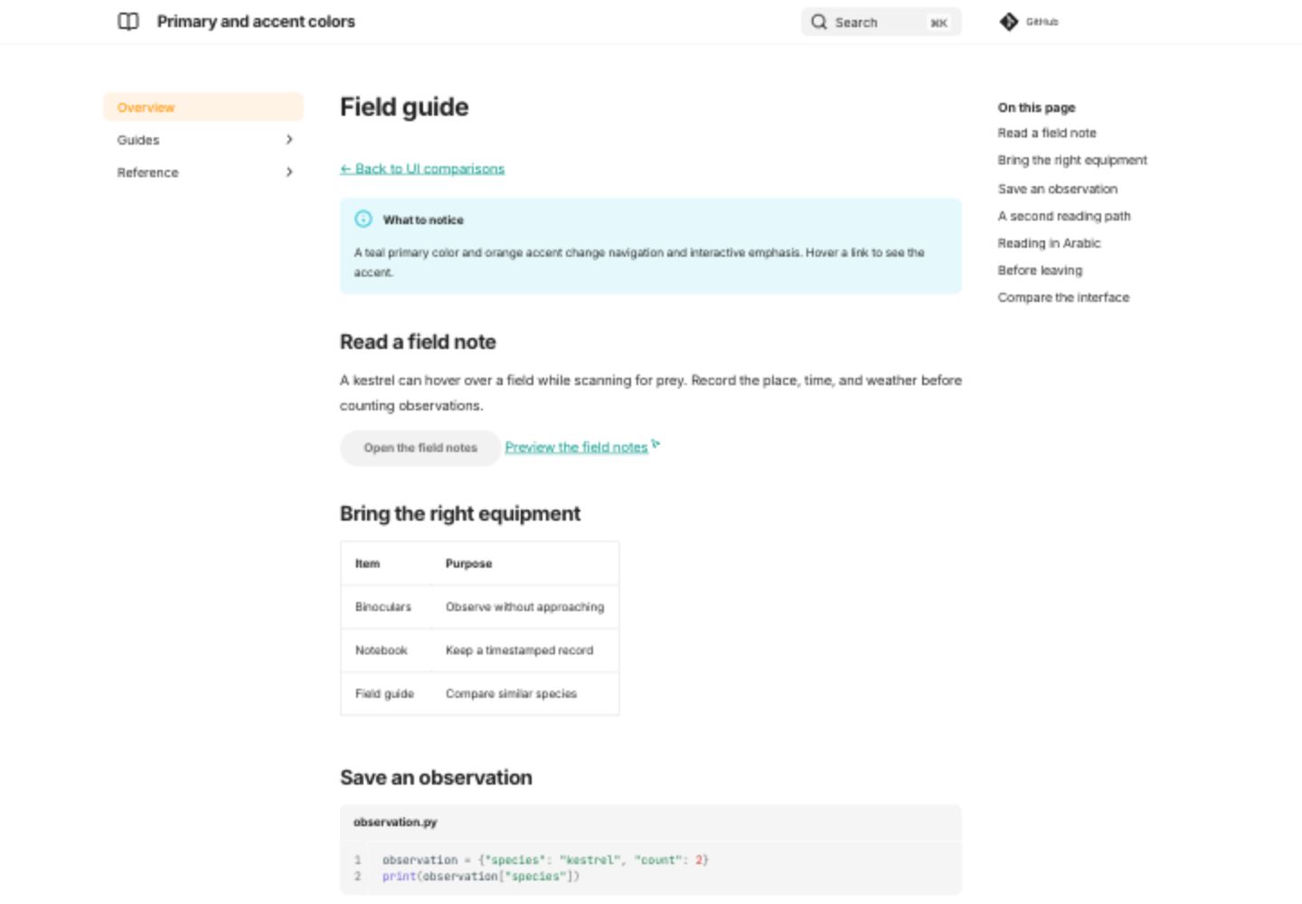
Primary and accent colors
A teal primary color and orange accent change navigation and interactive emphasis. Hover a link to see the accent.
Open live primary and accent colors demo
Screenshot: Primary and accent colors
Settings used in this comparison
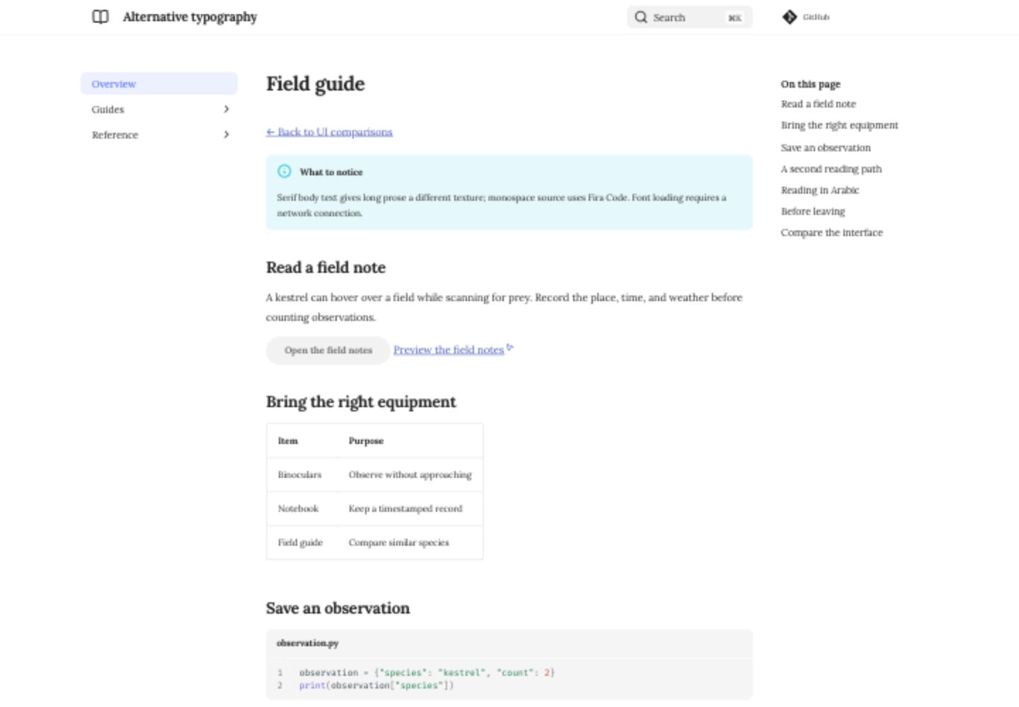
Alternative typography
Serif body text gives long prose a different texture; monospace source uses Fira Code. Font loading requires a network connection.
Open live alternative typography demo
Screenshot: Alternative typography
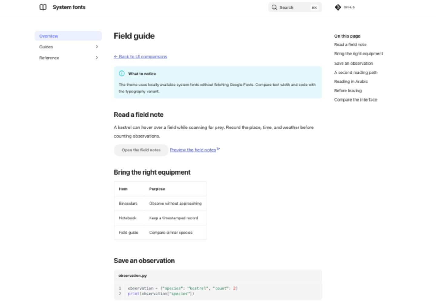
System fonts
The theme uses locally available system fonts without fetching Google Fonts. Compare text width and code with the typography variant.
Screenshot: System fonts
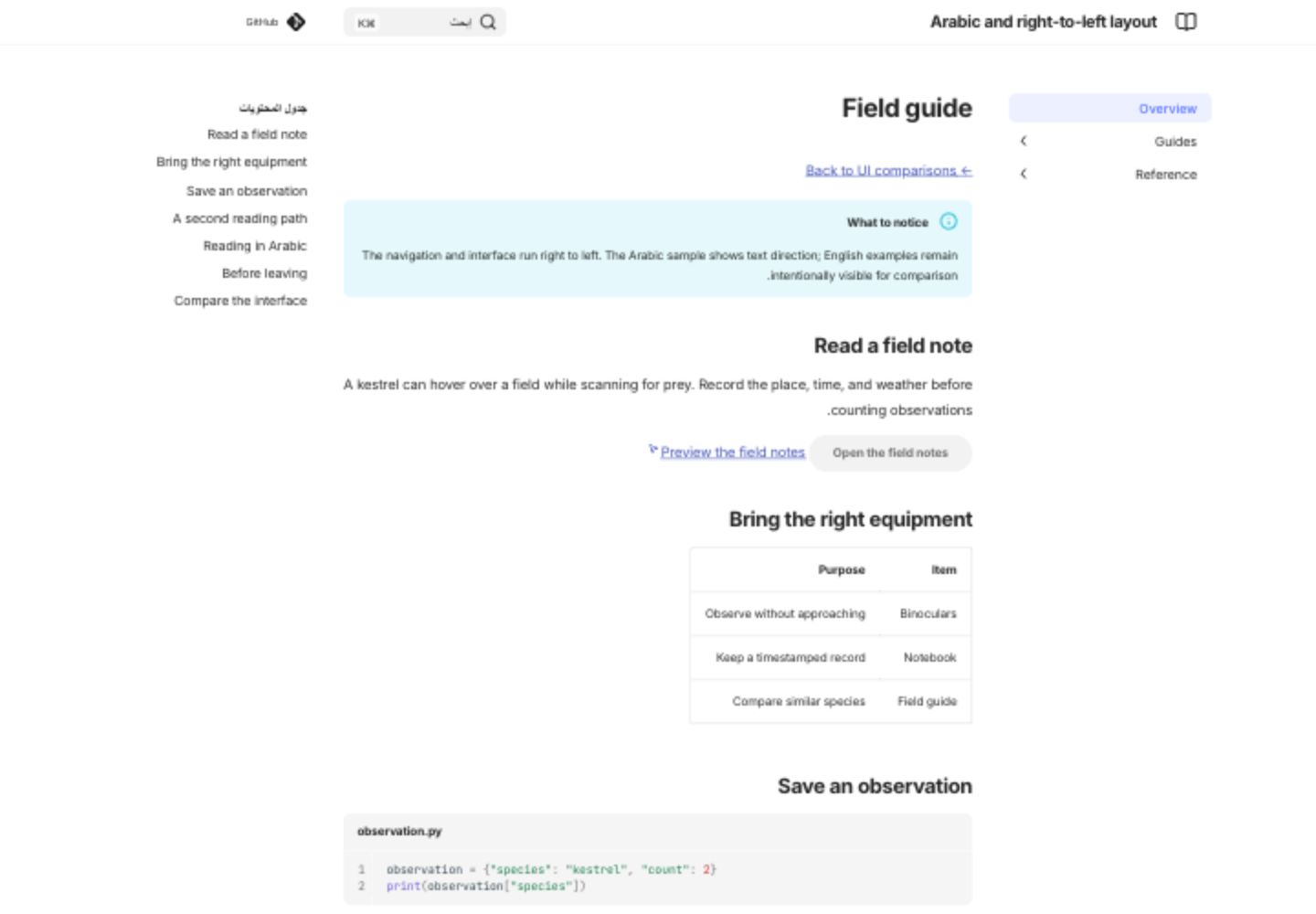
Arabic and right-to-left layout
The navigation and interface run right to left. The Arabic sample shows text direction; English examples remain intentionally visible for comparison.
Open live arabic and right-to-left layout demo
Screenshot: Arabic and right-to-left layout
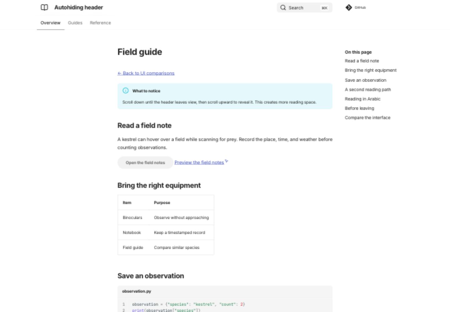
Autohiding header
Scroll down until the header leaves view, then scroll upward to reveal it. This creates more reading space.
Open live autohiding header demo
Screenshot: Autohiding header
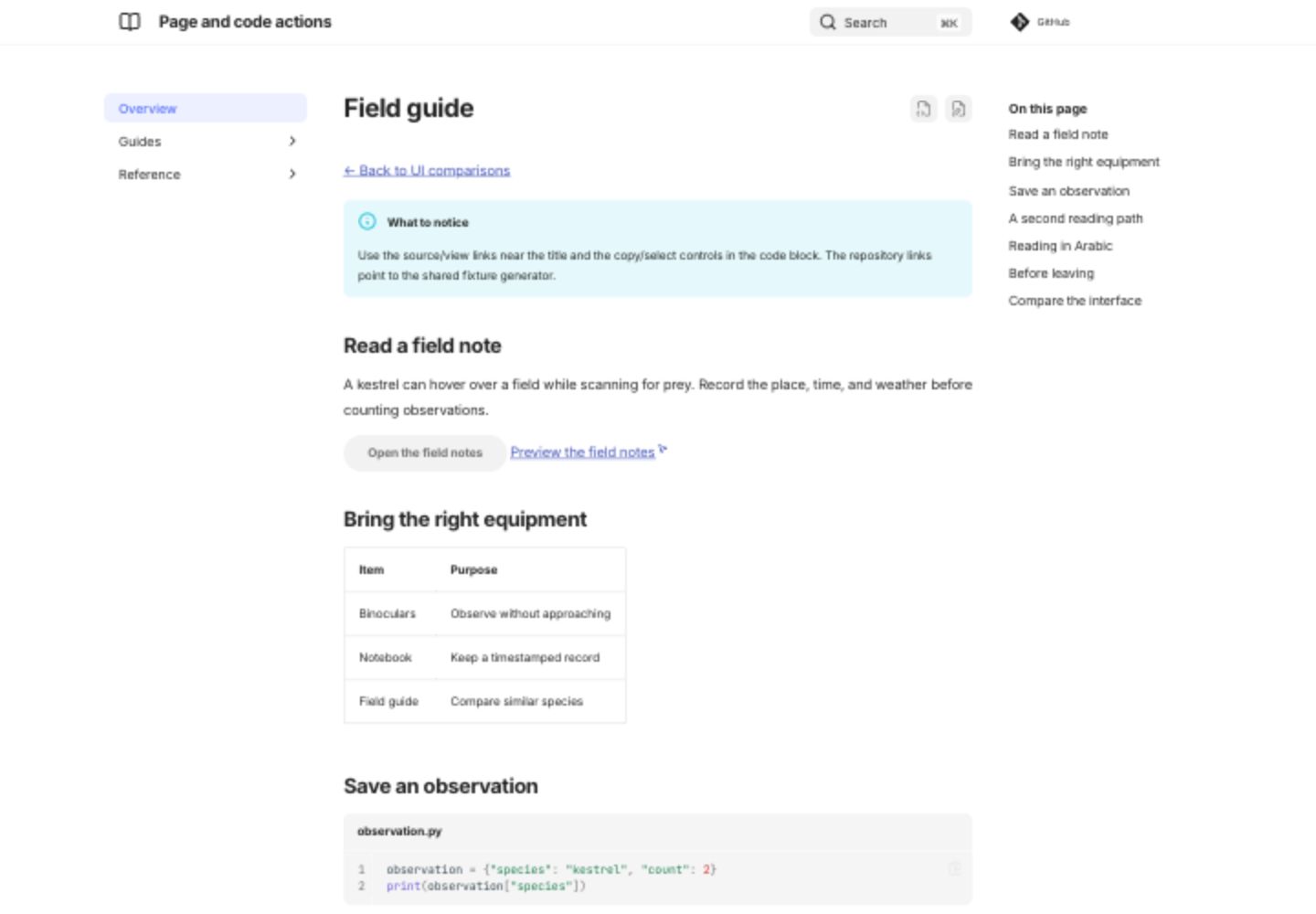
Page and code actions
Use the source/view links near the title and the copy/select controls in the code block. The repository links point to the shared fixture generator.
Open live page and code actions demo
Screenshot: Page and code actions
Settings used in this comparison
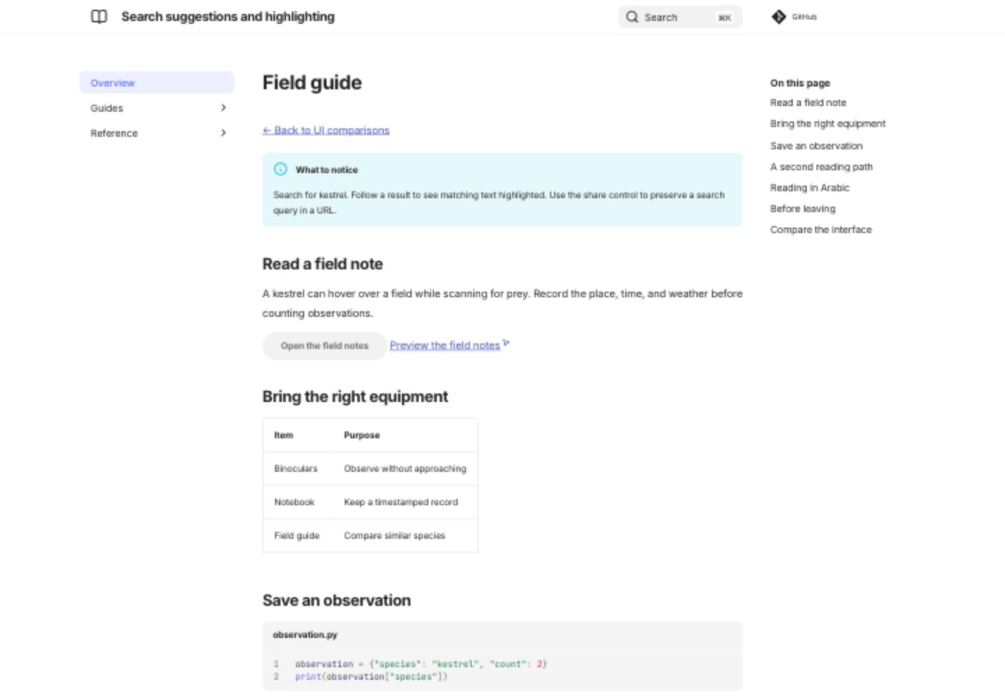
Search suggestions and highlighting
Search for kestrel. Follow a result to see matching text highlighted. Use the share control to preserve a search query in a URL.
Open live search suggestions and highlighting demo
Screenshot: Search suggestions and highlighting
Screenshot comparisons
The screenshot gallery compares actual desktop renders. Expand the screenshot beside any live demo above for its initial view.
Choosing a layout
Use sections for a short manual whose structure should stay visible. Tabs suit several major audiences or product areas. Expanded navigation is useful when the entire tree fits comfortably on screen. Pruning helps large trees; it cannot be combined with expansion. An integrated contents list saves a sidebar but cannot be combined with section indexes.